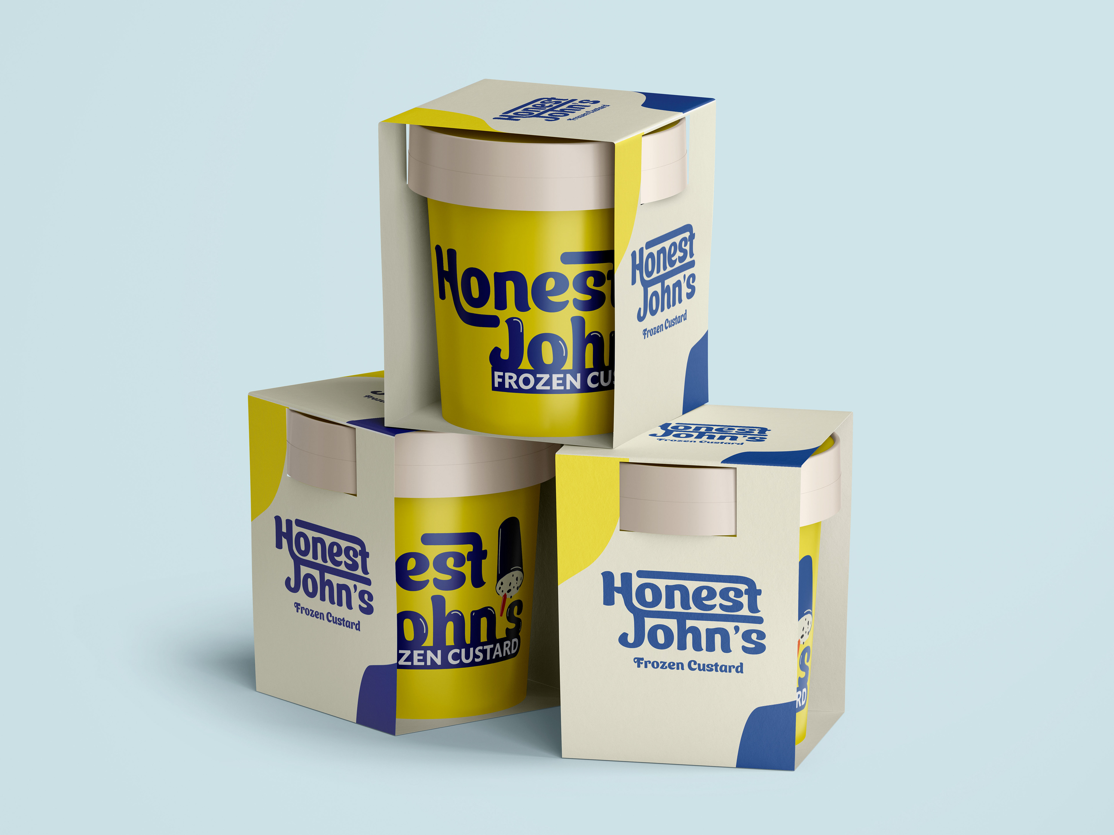
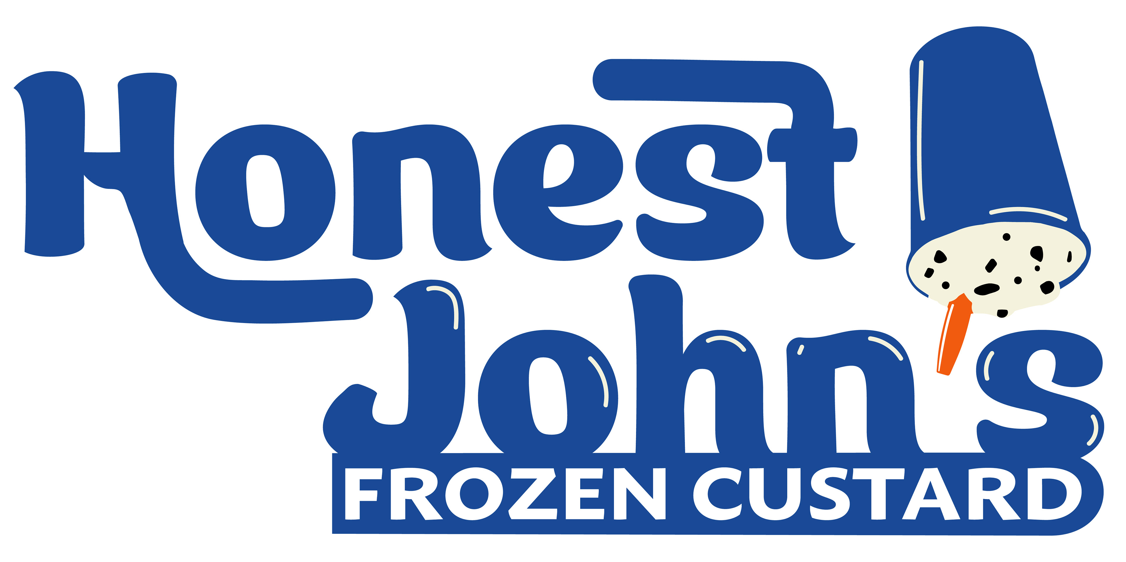

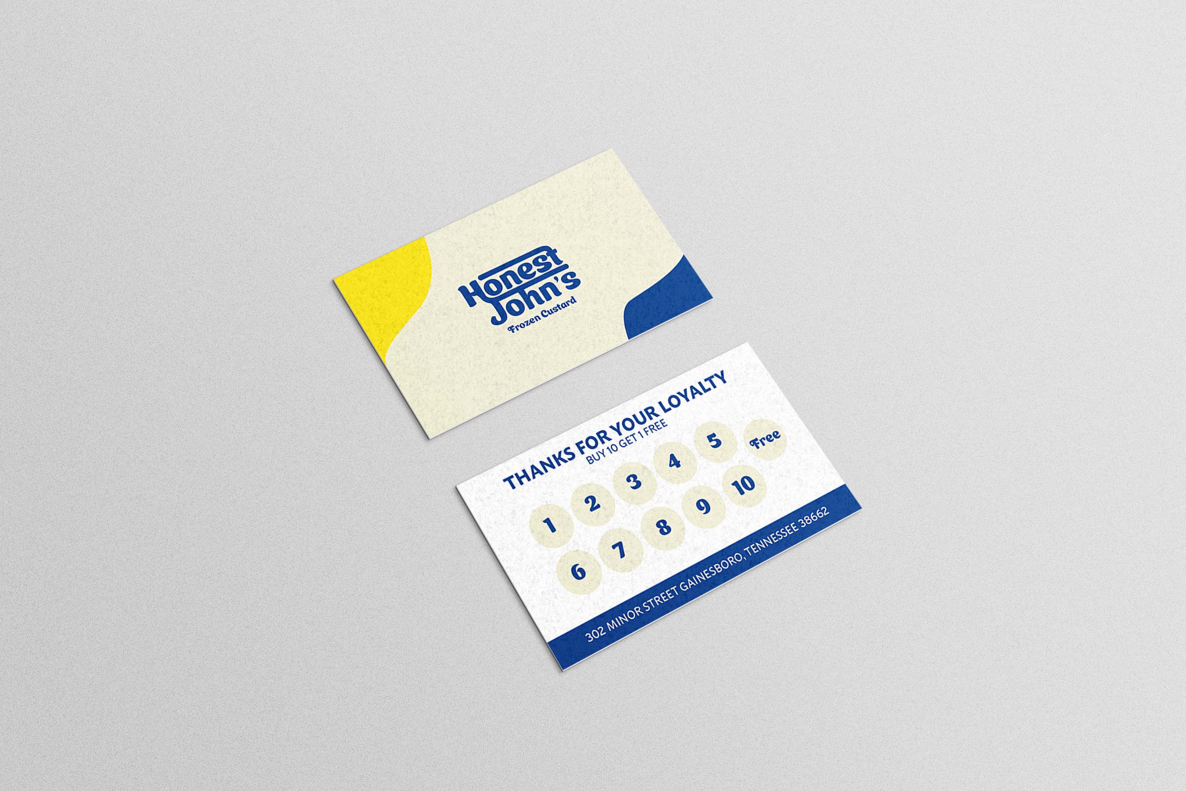
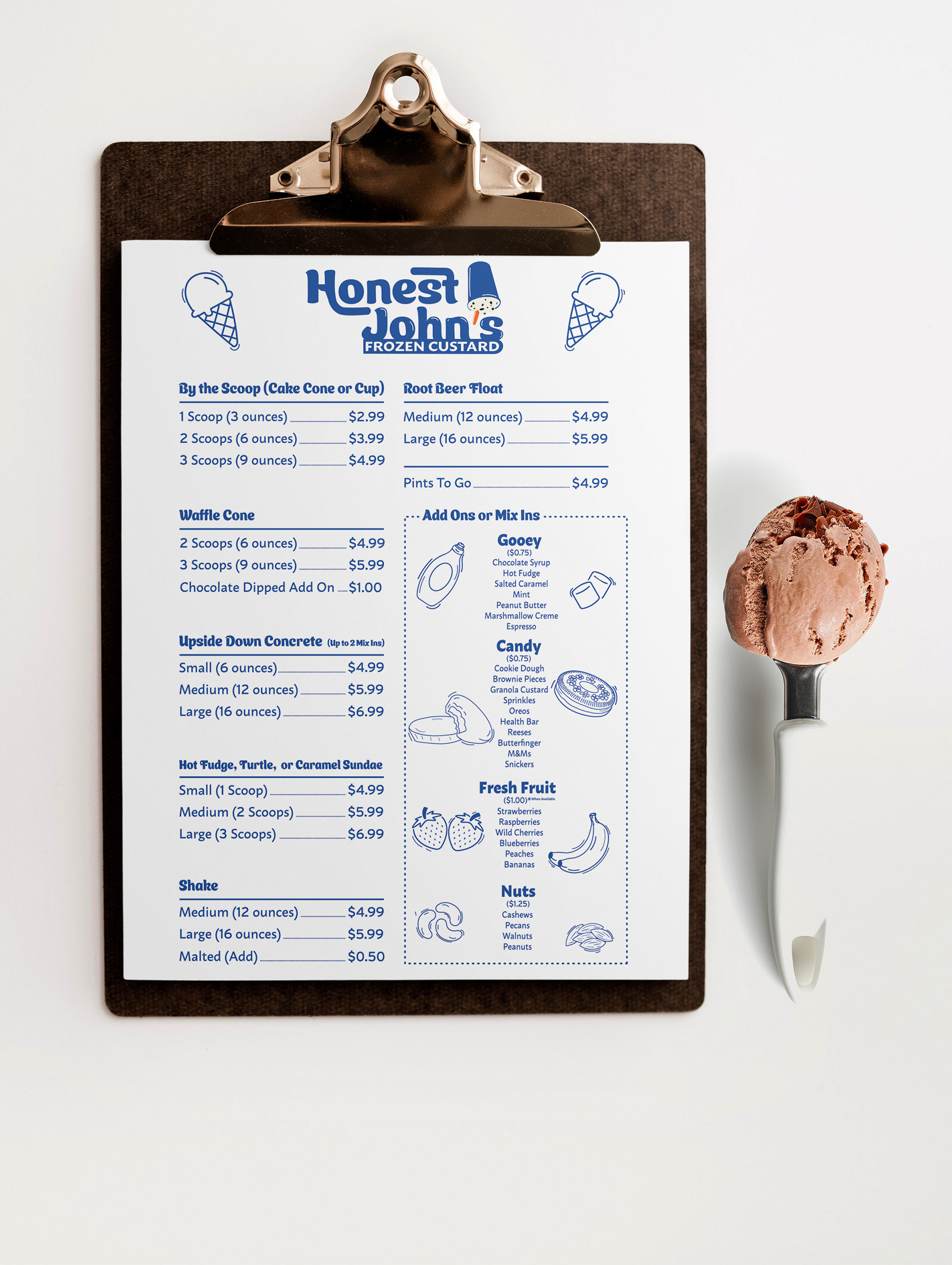
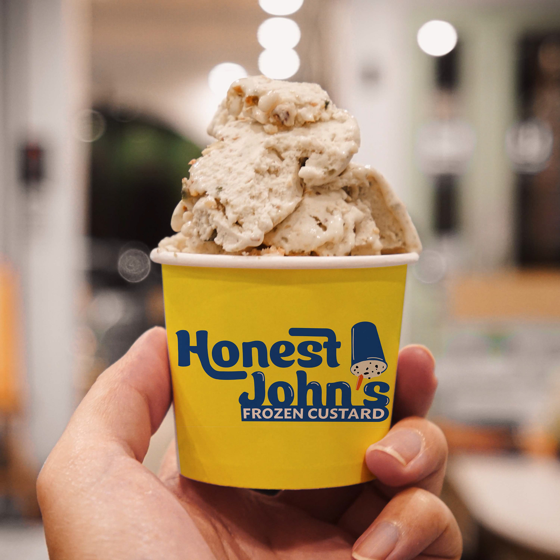
This project was for a client who is opening a new frozen custard shop. I decided on a fun, bold type to give the feel of a scoop of frozen custard along with using blue as the main color to evoke coldness, honesty, and loyalty. The client’s one request was to include blue and yellow along with an upside down “concrete” so the decision was to have the spoon stick out as the apostrophe so it ties into the rest of the logo type.